We have just returned from our annual GMI Round Table event in sunny Mallorca, Spain. This is our favourite time of year because, together with around thirty GMI members, we all come together and spend a few days just brainstorming about the current global macro environment in a beautiful setting somewhere in the world. We present our core GMI views on the business cycle, and then stress test our hypotheses with some of the best investment minds in the industry. The output of these few days is nothing short of incredible. Great people, great location and great wine – the recipe for all excellent conversations!
In this week’s newsletter, we’re going to run through the April CPI data and also talk about bonds...
As ever, much fuller and more in-depth analysis can be found in Global Macro Investor and Real Vision Pro Macro. Global Macro Investor is our full institutional research service and Real Vision Pro Macro is the sophisticated retail investor service, which is co-authored with leading research firm MI2 Partners.
The view from the hotel in Mallorca – a view worth sharing! Ok, let’s get started...
GMI Chart 1 – US PPI YoY% vs. US CPI YoY%
Another month, another negative surprise in April US CPI data as we’ve been expecting: 4.9% YoY vs. 5.0 expected. US PPI also came in below consensus expectations in April (2.3% YoY vs. expectations for 2.5%) and indicates that CPI should work below 3% over the next one to two months...
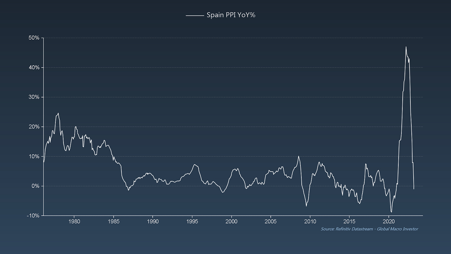
And here’s the important bit, it’s not just the US that is seeing inflation evaporate. Spain PPI came in at -1% in March, the first negative print since Dec 2020 and officially now in the deflation camp. We also can’t think of a better chart to illustrate the point we have been making for almost a year now that, due to the base effect, extreme inflation cycles are almost always reflexive (symmetrical in rise and fall) ...
... elevator-up = elevator-down...
It’s the same story in China: deflation...
... and ditto when looking at Brazil: deflation...
... Norway: deflation...
The bottom line is that inflationary pressures are easing fast and prices are already starting to fall in certain countries. Additionally, many of the countries listed above tend to be leading in the inflation cycle due to their commodity linkage. For example, China PPI is currently already pricing US CPI closer to 0%. Remember, commodity inflation leads goods inflation, which then leads services inflation. So, just like our GMI Business Cycle Dominoes, inflation is also a story of price dominoes...
GMI Chart 2 – New York Fed Global Supply Chain Pressure Index vs. Global CISI
Inflation surprises globally also just turned negative for the first time since Nov 2020 and, due to the now complete normalisation of supply chains, the negative inflation surprise cycle has only just begun...
GMI Chart 3 – Median Price of Existing One Family Home Sales YoY% vs. US CPI: Shelter YoY%
Also, circling back on the inflation domino story, CPI: Shelter is 35% of Headline CPI and roughly 60% of CPI: Services – this is the “sticky” part of inflation that everyone is talking about. However, as we’ve now pointed out many times, “sticky” is just a fancy term for lagging, and CPI: Shelter just lags house prices by eighteen months. Since last year, we’ve also been warning about a period of house price deflation – that part of the business cycle has arrived and CPI: Shelter will soon peak and then work lower into 2025...
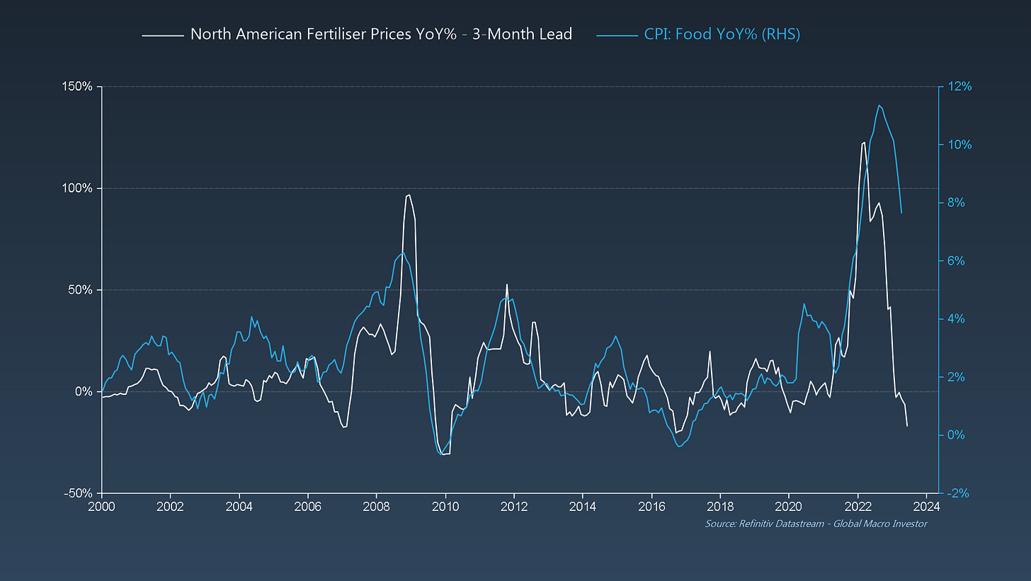
GMI Chart 4 – North American Fertiliser Prices YoY% vs. US CPI: Food YoY%
Food is another “sticky” inflation area that many people are talking about – peaked and projected to fall like a stone now. Fertiliser prices lead by three months. Another elevator-up = elevator-down chart...
GMI Chart 5 – Atlanta Fed Wage Growth Tracker vs. GMI Wage Growth Tracker
Wages are where we get the most pushback but, there again, wages are not “sticky”, they’re just lagging. This is a very similar complex to how unemployment just lags the ISM by around six months; the labour market is always extremely lagging and just gives us a view of the business cycle about six months ago...
The GMI Big Picture
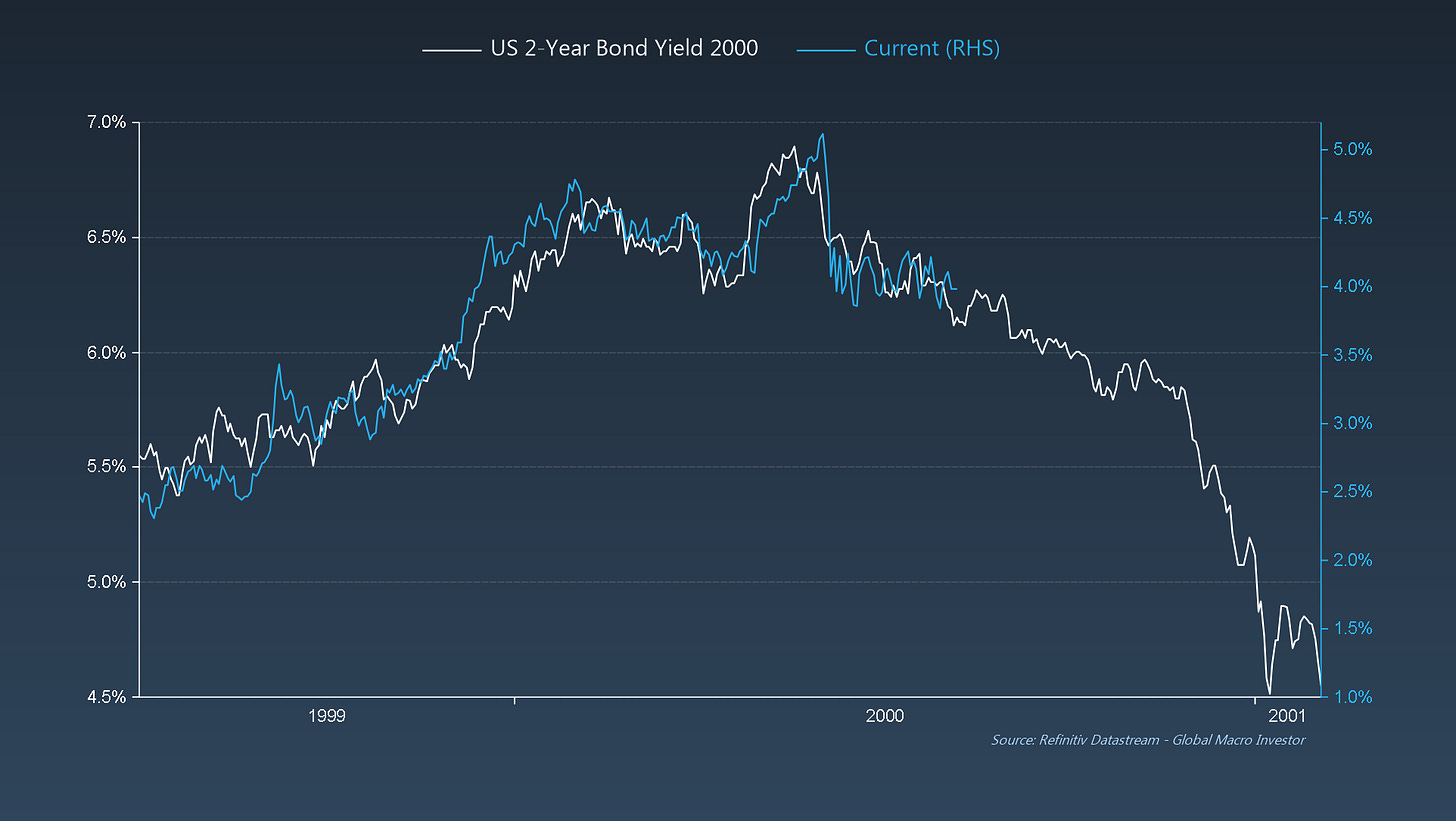
To conclude: inflation is yesterday’s news, and the bond market is starting to pick up on this. We also think that all the noise around the debt ceiling accelerates the move lower in bond yields. In fact, 2-Year Bond Yields are trading much as they did in the early 2000s, where the final move higher in yields was the ultimate bull trap just before the BIG move lower – we think it plays out similarly this time around...
Additionally, we think that the extreme move we saw in bond yields last year was also just an equal but opposite swing to the pandemic panic; now that move will again start to work in the opposite direction, which would suggest at least 200bps of rate cuts over the next eighteen months...
... and literally no one is prepared for this – positioning in 2-year USTs is the shortest since May 2007...
The key takeaway? The pain trade in bond yields is clearly lower from here, not higher.
Good luck out there and see you all next week with another update. Enjoy!
Raoul Pal – CEO, Founder - Global Macro Investor
Julien Bittel – Head of Macro Research - Global Macro Investor


Next bull run, first thing i'm doing with profits is buying a membership!
Absolutely love reading these, great content.
I absolutely love these charts and commentary. We didn't have an update last week, and I thought I was going through withdrawals.