Terrifying Charts…
These are complicated times in macro; things have deteriorated in ALL forward-looking data. I have to say that in my entire career, I have never seen data fall apart this dramatically and this fast.
Macro data, however, can often seem esoteric, as if it lived in a vacuum that only bankers, traders or investors pay attention to. That is, until the data hits home. That’s when shit gets scary…
So, let’s have a look at how US consumers and the housing market are faring in this macro environment. I’ll preface this short tour into the charts by saying that the level of destruction in many cases is UNPRECEDENTED.
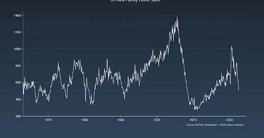
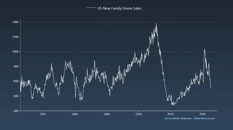
First up, housing data. It literally fell off a cliff…
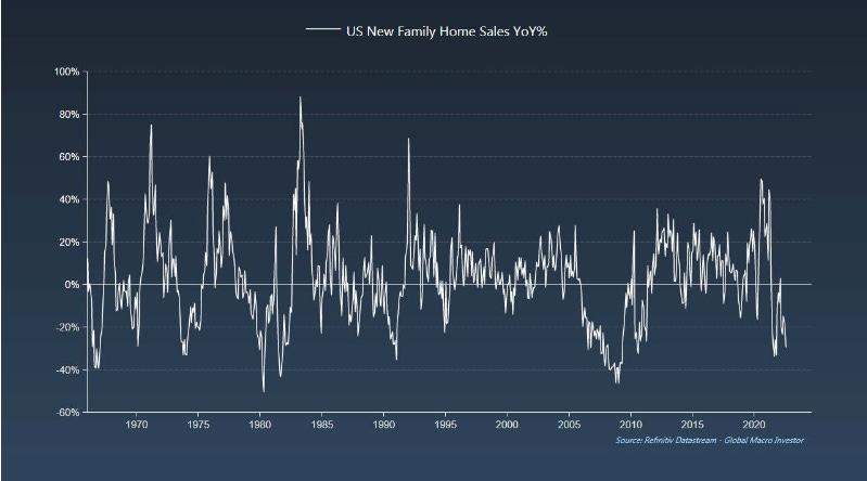
In year-on year terms, New Family Home Sales are down 30%...
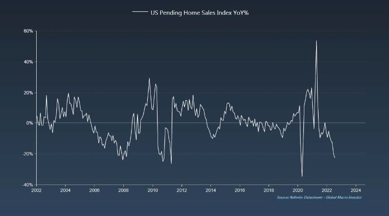
... with Pending Home Sales rapidly approaching pandemic lows…
Housing Starts year-on-year are also negative…
… and the same applies to MBA Mortgage Purchases…
The following is particularly alarming as you can see that the Monthly Supply of New Homes just exploded to 10.9 months. This tells us that prices are about to collapse...
… which is extremely bad news for everyone who took on a new/additional mortgage last year…
I think this may be the scariest chart in macro right now: US 30-Year Mortgages are up 90% YoY. This is the growth collapse I have been warning about... UNPRECEDENTED!
It’s also the primary driver behind collapsing homebuilder sentiment…
During periods of crisis, homebuyers typically lead. What does this signal? It’s suggesting that a lot more downside is on the cards…
But the pain doesn’t stop there: it’s not just housing. Look at total US Consumer Buying Conditions, a truly horrific chart…
Car sales are deeply negative too…
Additionally, the savings rate has completely collapsed, by far the sharpest fall in history...
… which makes this next chart particularly worrying…
Retail Sales tell a similarly sickening story. In real terms, they are down 7% from their peak in March of last year…
And here’s another really interesting chart: all the growth has been in the price which is the reason inventories are building. However, this may actually help earnings hold up as there is a 9% lift from inflation…
Case in point: the rise in Wholesaler’s Inventories is literally unprecedented…
Manufacturing and Trade Inventories are only slightly better, riding 40-year highs…
Once again, speaking more generally, the rise in yields in rate of change terms, is simply unparalleled…
… which alone is responsible for the massive tightening of financial conditions…
In the US, consumer spending represents 70% of GDP. Make no mistake, when the consumer comes under too much pressure, the economy will come to a screeching halt.
I’ll leave you with one last chart showing that all twelve of the major ISM lead indicators we track at GMI are suggesting we’re heading lower, with our primary lead indicator forecasting a move below 40 this year before bottoming out in early Q1 2023. Remember, 47 is the key number in the ISM. A move below there and we are in full-blown recession...
As ever, be careful out there. These are complicated times…
If you are interested in learning more about Global Macro Investor, my original, thought-provoking and completely independent research publication, click here.

