In this week’s newsletter, we’re going to run through the top five macro charts that are on our radar...
As ever, much fuller and more in-depth analysis can be found in Global Macro Investor and Real Vision Pro Macro. Global Macro Investor is our full institutional research service and Real Vision Pro Macro is the sophisticated retail investor service, which is co-authored with leading research firm MI2 Partners.
Let’s dive right in...
GMI Chart 1 – US CPI Dashboard YoY%
Surprise, surprise...
Another month, another weaker-than-expected CPI report in June (3.0% YoY vs. 3.1% expected) with all major subcomponents coming in lower for the month.
Core CPI also came in below expectations (4.8% YoY vs. 5.0% expected) and on a MoM, annualised basis, now runs below the Fed’s 2% target at 1.9%. This is something that we’ve been talking about for months now and we very much expect Core to continue lower for the rest of the year and into 2024...
And here’s the thing:
There is no such thing as “sticky inflation” – inflation cycles just tend to play out in stages, like dominoes. In a nutshell, commodity inflation leads goods inflation, which in turn leads services inflation...
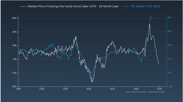
GMI Chart 2 – Median Price of Existing One-Family Home Sales YoY% vs. CPI: Shelter YoY%
We’ve shown you this chart a couple of times now and it illustrates this point well. Shelter inflation remaining high is the main reason Core is still elevated. CPI: Shelter is roughly 60% of CPI: Services, and CPI: Services accounts for 58% of total CPI, so a significant chunk of the pie, though not “sticky” and just lags house prices by eighteen months...
GMI Chart 3 – Atlanta Fed Core Sticky CPI YoY% (Headline + Ex-Shelter)
In fact, excluding Shelter, the Atlanta Fed’s measure of “sticky” inflation is now below 3.5% and projected to fall a lot further as the base effect continues to unwind. Even if we include Shelter and take the composite figure currently at 5.6%, it’s obvious that the main reason it remains elevated is down to Shelter and, as shown in the above chart, we’re going to see big disinflation over the next twelve to eighteen months as lower house prices filter though into the CPI numbers...
GMI Chart 4 – CPI: All Items Less Shelter YoY%
Excluding the hugely lagging Shelter component, the YoY change in CPI just fell to 0.7% in June...
GMI Chart 5 – CPI: All Items Less Food, Shelter, and Energy MoM%
And if we look at the Core number excluding Shelter, the MoM figure just went negative for the first time since January 2021.
Sticky Inflation? Definitely not...
The GMI Big Picture
The bottom line, in our opinion, is that there is nothing unusual about the way this inflation cycle is playing out, and the “sticky” elements of inflation that everyone is talking about are just the most lagging components of inflation that take more time to work out of the system...
This week we also saw the PPI numbers for the month of June, which came in at just 0.1% YoY (yes, 0.1%!!!). This basically puts CPI at 0% over the next couple of months, in line with our expectations...
And our view has been – since Q4 of last year – that this would be positive for equities and risk assets...
The last graphic we’ll leave you with is the following:
Right now (and for some time), the loudest narrative out there is “sticky inflation”. We have yet to see a single model forecast this scenario except for a chart of the 1970’s inflation cycle and a doomer/monetarist narrative. At GMI, we’ve had the complete opposite view all year and this has been driving our more bullish take, coupled with our Everything Code framework (debasement and liquidity cycle) ...
Our advice? Don’t mid-curve it.
That’s it from us this week. See you all next week with another update.
Enjoy!
Raoul Pal – CEO, Founder - Global Macro Investor
Julien Bittel – Head of Macro Research - Global Macro Investor


Top!
Brillant work guys! I joined up with RealVision - Plus!.
Cheers Peter (Australia)