In this week’s newsletter, we’re going to run through the top five macro charts on our radar...
As ever, much fuller and more in-depth analysis can be found in Global Macro Investor and Real Vision Pro Macro. Global Macro Investor is our full institutional research service and Real Vision Pro Macro is the sophisticated retail investor service, which is co-authored with leading research firm MI2 Partners.
Let’s dive right in...
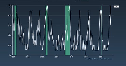
GMI Chart 1 – % of ISM Subcomponents in Contraction Territory (<50)
This chart certainly made the rounds this past week on the June ISM release showing that 100% of ISM subcomponents are back below 50. The chart lit up FinTwit macro bear feeds as they tried to spin yet another bearish take on the data despite continued improvement underneath the surface, which I’ll come to in a minute.
Looking at the percentage of subcomponents in contraction territory is not the best way to think about the current state of the manufacturing sector as some of the ISM’s components can be quite lagging.
For example, during the Global Financial Crisis in 2008, ISM Consumer Inventories only fell below 50 in April 2009, despite eight consecutive months of sub-50 readings on the headline ISM number from September 2008 - April 2009, driven by a collapse in the more leading components like New Orders.
Also, if you remember back, the market bottomed in March 2009, so this is obviously not a great way to monitor the business cycle. Moving on...
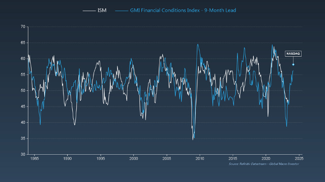
GMI Chart 2 – ISM vs. ISM New Orders Minus Inventories
THIS, on the other hand – the ongoing improvement in ISM New Orders minus Inventories – is THE key takeaway from the June ISM report. It’s what matters for equities and is why the S&P 500 continues to rise despite the same bearish narratives being thrown around month-in and month-out. Yawn.
The picture is crystal clear looking at this chart: New Orders minus Inventories up = S&P 500 up...
The NDX has been more forward looking and trades in line with our GMI Financial Conditions Index.
We think the NDX may get to new all-time highs by November; the same applies to ETH. The NDX continues to outperform current liquidity conditions. This also happened in the past in 2019, for example – you can’t hold a beach ball underwater for long – the NDX will always tend to outperform.
Remember: NDX = Debasement + Secular trend
GMI Chart 3 – GMI Business Cycle Dominoes
And while everyone is looking at the ongoing improvement in ISM New Orders minus Inventories and scratching their heads thinking that this will now impact the employment numbers, it won’t (for now).
ISM New Orders minus Inventories leads the headline ISM number by 2-3 months and the unemployment rate, like corporate earnings, just lags the ISM by 5-6 months.
Just like the inflation cycle, the growth cycle is a series of economic dominoes, the reason why we put this framework together to help everyone focus on what’s really important...
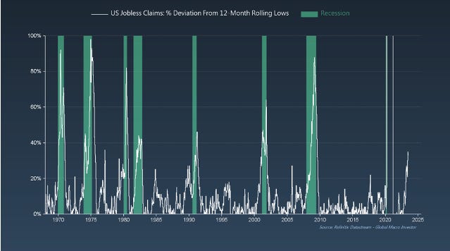
GMI Chart 4 – US Jobless Claims: % Deviation From 12-Month Rolling Lows
This is also why we’re still expecting the unemployment rate to rise – Jobless Claims are leading...
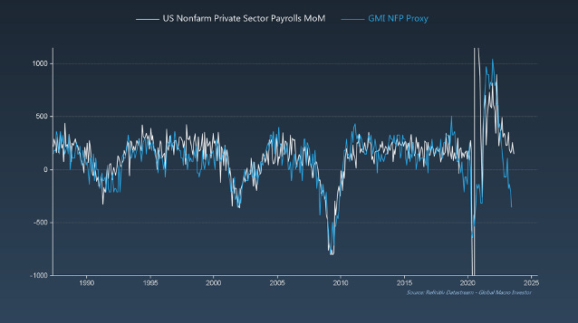
GMI Chart 5 – US Employees on Nonfarm Payrolls Total Government SA
Also, we’ve now had five consecutive months of negative NFP revisions. This month we came in at 209k jobs added for June versus 230k expected, and last months’ number being revised down from 339k to 306k. Not a great look. Don’t get me wrong, these numbers are still high, but you also need to adjust for public sector job growth as Government payrolls are not very cyclical and tend to rise into recession...
If we remove public sector job growth from the equation, only 149k jobs were added in June (200k expected) – a new cycle low – and based on some of our forward-looking indicators, should continue lower for the time being...
The GMI Big Picture
To conclude, it was a mixed week for labour market data. ADP massively surprised to the upside and Challenger Job Cut Announcements came down. However, at the same time, Jobless Claims came in higher, Job Openings came in weaker than expected and NFP data negatively surprised with another negative revision to last month’s data.
Also, looking at the dollar’s reaction on Friday, we think the markets overall assessment of this week’s data was net/net somewhat less hawkish or the dollar would have rallied...
Our base case at GMI is that we’re trading within a larger symmetrical triangle (continuation pattern). A break of 100 likely means the next stop is 90, which we expect to play out over the next twelve to eighteen months as the business cycle starts to bottom – a broadly supportive environment for risk assets...
The last chart we’ll leave you with to mull over is the following. Dollar weakness is not the ONLY thing that matters for risk assets and crypto markets, but looking back, it’s a pretty big plus...
That’s it from us this week. Enjoy the rest of your weekend and see you all next week.
Enjoy!
Raoul Pal – CEO, Founder - Global Macro Investor
Julien Bittel – Head of Macro Research - Global Macro Investor


Thanks Raoul. I eventually became a Global Macro Investor subscriber because of these Sunday snippets, so your effort is greatly appreciated by me and I'm sure will be by other future GMI subscribers ... I've already made a quarter mill on solana (bought 50k SOL at $16) so thanks and the $17.5k subscription per annum sure looks small now compared to how much I will earn and, I'm sure, preserve that wealth over the many years ahead ... Thank you for doing this with your semi-retired (haha I know you work your azz off in Cayman) life and finding a way to learn and become wealthier while teaching us, who have come along for the ride in your classroom, to capture the wealth generated by this coming Exponential Age.
Thanks Raoul & Julien.
Did anyone else read this statement: 'We think the NDX may get to new all-time highs by November; the same applies to ETH.' as the expectation is new ATH for ETH i.e. > 4.8K by mid/late Q4?
Or am I reading this incorrectly?